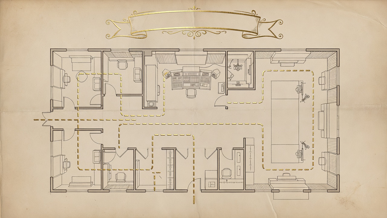
Friction first, furniture second
Think about the last time you squeezed sideways past a chair, or carried a laundry basket around the end of a bed. In a compact home these moments happen dozens of times a day. Each one is small, but together they make a flat feel cramped even when the square metres are reasonable. That is why we suggest starting with the routes you walk, rather than with a picture of the finished room.
Furniture that blocks a path effectively costs you twice: once for its own footprint and again for the floor it makes awkward to cross. A sofa floating in the middle of a studio might look generous in a showroom, but if it forces you to detour every time you go to the kitchen, it is consuming more space than it contributes.
Run a two-day route audit
Your first space fix doesn't need a tape measure. For two ordinary days, notice where you pause, sidestep or put something down "for now". Then write down your three most frequent journeys. For most people they look like this:
- Front door to the place where bags, keys and coats end up.
- Bed to bathroom, often in low light.
- Kitchen to wherever you actually eat.
Sketch your room roughly on paper and draw those routes as lines. Wherever a line crosses a piece of furniture, you've found a bottleneck. Fix the busiest one first. It is often a single move, such as turning a desk ninety degrees or swapping a round table for a drop-leaf.
How wide should a path be?
Reference books such as Ernst Neufert's Architects' Data have long informed the circulation widths designers use. As a practical rule of thumb, many planners work from about 90 cm for a main walkway and accept 60–75 cm for a secondary squeeze, such as the gap between a bed and a wardrobe. If you use a wheelchair or walking aid, or share your home with someone who does, plan more generously and follow accessibility guidance rather than these general figures.
You don't need to hit these numbers everywhere. Prioritise the routes from your audit and let rarely used corners be tighter.
Zones without walls
In a studio or open-plan flat, the challenge is making one room behave like several. You can signal a change of use without building anything. A rug defines a living area; a pendant or floor lamp marks a dining spot; an open shelving unit placed perpendicular to a wall separates the bed from the sofa while still letting light through.
Christopher Alexander's A Pattern Language (1977) describes how people gravitate towards edges, alcoves and window places. That idea is useful in small homes: tuck seating into corners and along walls, and keep the centre of the room for movement.
For inspiration at the extreme end, architect Gary Chang's Hong Kong apartment, often called the Domestic Transformer, uses sliding wall panels to create many room configurations in roughly 32 square metres. Most of us won't rebuild our walls, but the principle carries over: let one zone expand when it's in use and shrink when it isn't.
Trade-offs worth weighing
- Sofa against the wall frees the floor but can feel less sociable. A small swivel chair opposite helps conversation.
- Bed in a corner saves a path on one side, but making it becomes slightly harder.
- Open shelving dividers add storage and separation, yet they show clutter from both sides.
None of these is right or wrong. Pick the trade-off that removes your biggest daily bottleneck.
Renter-friendly layout moves
If you can't paint or drill, layout is your most powerful tool. Furniture on castors, freestanding room dividers and lamps that replace ceiling lights all let you re-zone without touching the walls. When you move out, everything comes with you.